Today’s culture is obsessed with data. We love approval ratings of presidents, how the public feels about prescription drugs, and the ratings of our favorite TV shows. So it’s no wonder that infographics have been all the rage online.
If you’re not familiar with infographics, here’s the scoop: they are a way to visualize and absorb data quickly through graphics. But just like anything, there’s good and there’s bad infographics. Bad infographics don’t go viral. Great ones do. Here are some tips for creating and designing brilliant, wonderful, great infographics.
Great infographics tell a story
The whole point of an infographic is to stray away from boring data. How do you do that? By telling a story. Anyone can slap some charts and graphs on a canvas and call it an infographic, but great infographics establish an emotional connection through stories. Stories can make anything interesting. Even the boring topics. Take a look at this interview with Chairman and CEO of Mandalay Bay, Peter Guber, about how to use purposeful storytelling to engage audiences:
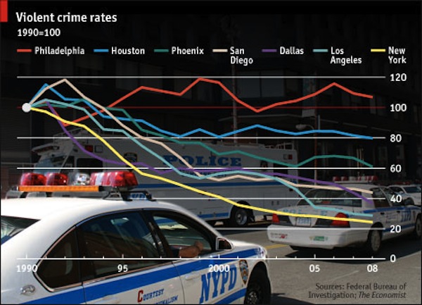
Take a look at this bad infographic:
Not only is it ugly and its data is misleading, but it tells no story. I may now know some percentage changes in violent crime rates, but I can guarantee I’m not passing it on. It didn’t connect with me.
Now take a look at this one:
It’s a battle! A clash of the titans on one of the internet’s most important subjects today: privacy and security. It makes me ask, “Who am I rooting for?”
See the difference?
By creating a narrative you can engage audiences, draw them in, and make them want to pass around your infographic.
Great infographics are specific
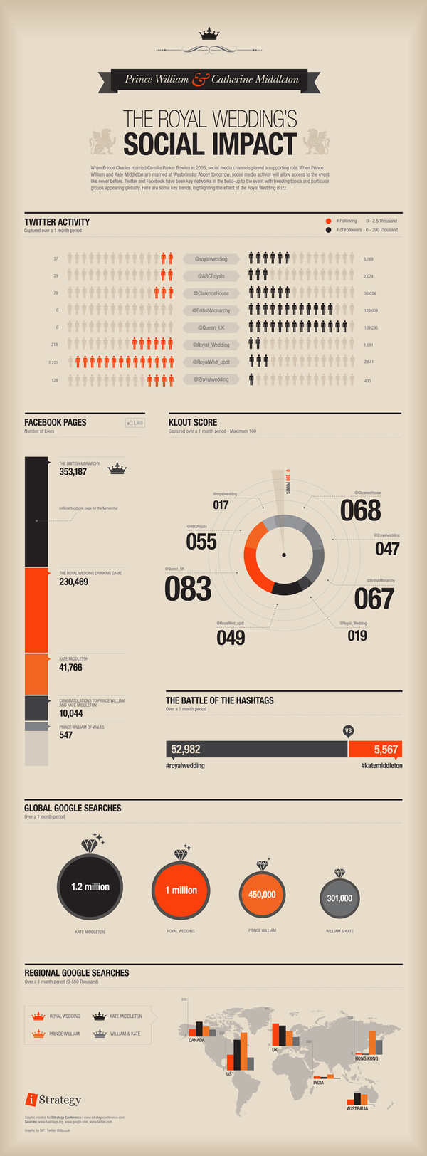
Imagine trying to sum up the Royal Wedding. Where would you begin? There just are far too many elements to include. But the social impact of the royal wedding online, now there’s a concept.
Great infographics use short text
Shakespeare once wrote, “..brevity is the soul of wit.” There is far too little time in this world for it to be wasted. Make it brief and make it concise. If you don’t, you’ll lose us in your monstrous paragraphs. And didn’t we click on this infographic link because we thought we’d get it quick and dirty?
This is not quick and dirty:
This is:
Great infographic titles say it all
Now this infographic isn’t bad, but it’s unclear. The title “The Mobile Advantage” tells us nothing. Does that mean people with mobile phones have more friends? Do mobile phones make us more money? Do they make us sexier? I have no idea because the title doesn’t tell me.
Now take a look at this infographic:
The title says it all. “What Does It Take to Get a Job at Google?” I know exactly what this infographic is about. It’s going to tell me everything I need to do in order to get hired by Google. Clear and informative. Much better than a title like “Google Jobs.”
Great infographics use credible sources
One source from Wikipedia isn’t going to cover it. Credibility is everything. Strictly from an ethical standpoint, you don’t want to mislead people with the wrong data. Plus they’ll find out — which they always do — and you’ll be torn to pieces. If you can’t find the data you need or collect it accurately, don’t do it. Find a new concept. Simple as that.
Here are a few sources for finding reliable data:
Census.gov – This is the data collected by the United States Census Bureau.
Data.gov – Data collected by the United States government.
Data.UN.org – Data collected by the UN.


Leave a Reply